

Custom Form Fields
Benefits
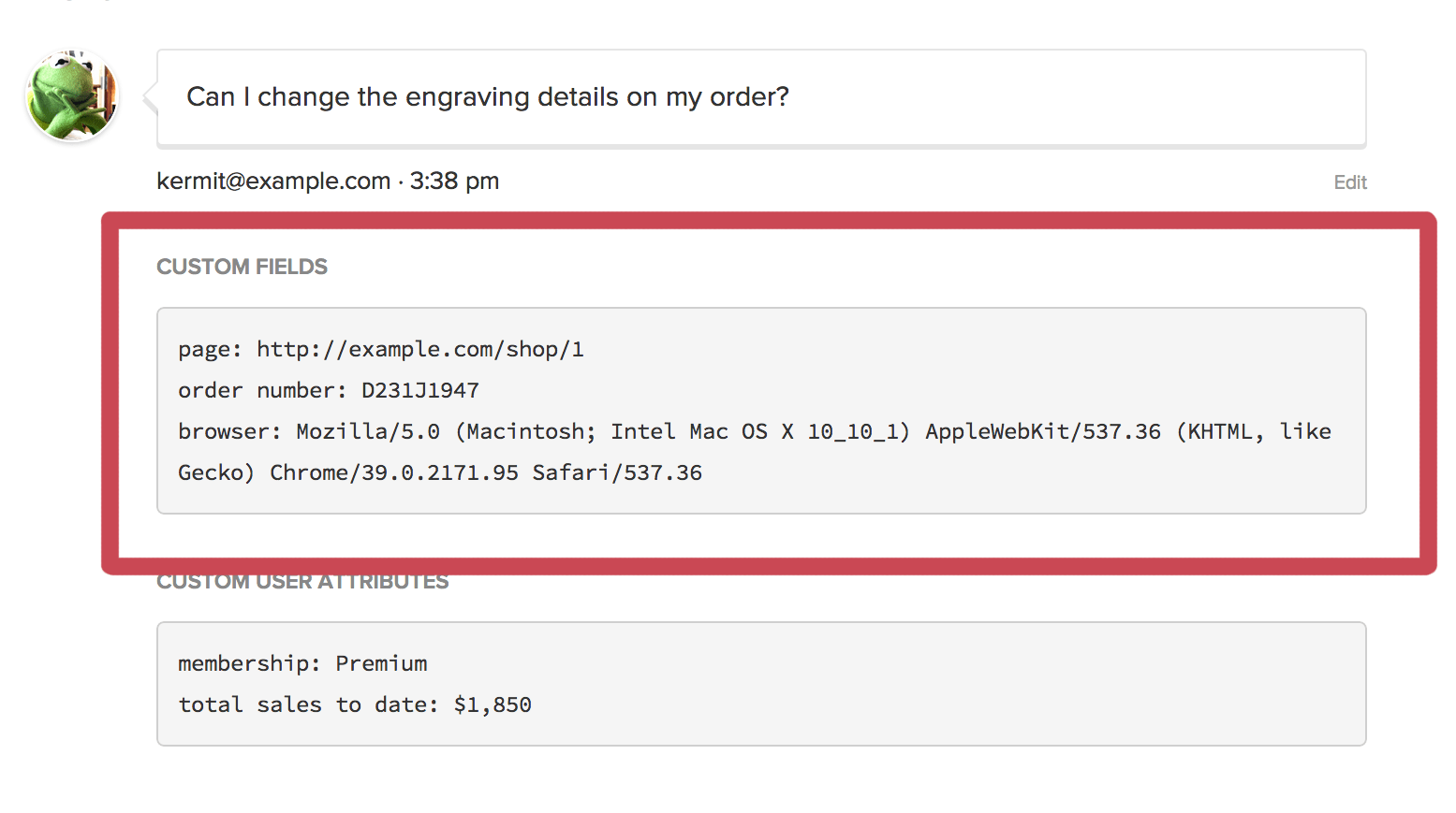
You can use custom form fields to ask the customer to provide additional information before submitting their inquiry. These attributes will then be displayed within Re:amaze as data attributes associated with the incoming conversation.
You can also use custom form fields to insert hidden values that are contextual to the current conversation. Values can be application specific or session specific (examples: browser information, IP address, or items in cart).

Installation
Make sure you have the Reamaze.js snippet installed from the Installation Step and a method of contact (Shoutbox, Lightbox, or Embeddable Contact Form)
<script type="text/javascript">
  _support['custom_fields'] = {
    // this is an example of hidden data sent with the message
    hidden_value: {
      type: "hidden",
      value: "anything you want",
      pos: 1
    },

    // this is an example of a dropdown with options that the user can select from
    dropdown_value: {
      type: "dropdown",
      value: ["Value 1", "Value 2", "Value 3"],
      placeholder: "Placeholder prompt",
      pos: 2
    },

    // this is an example of a free form text field
    order_no: {
      type: "text",
      value: "Default Value",
      placeholder: "Placeholder prompt",
      required: true,
      pos: 3
    },

    // this is an example of a checkbox field
    subscription_agree: {
      type: "checkbox",
      value: true,
      placeholder: "Please add me to your newsletter",
      required: false,
      pos: 4
    },

    // this is an example of a heading field
    heading_1: {
      type: "heading",
      value: "Please fill in all the fields above.",
      pos: 5
    }
  };
</script>
Copy and place the above code anywhere in your HTML. Then, replace the values above with custom key-value field values specific to your application.
The general format for each field is:
key: {
  type: "{hidden|dropdown|text|checkbox}",
  value: "{string for hidden and text types; array of strings for dropdown; true/false for checkbox}",
  placeholder: "{string for prompt, label, or placeholder value}",
  required: {true|false},
  pos: {integer for position of this field in the contact form. Lower position are shown first.}
}
-
hiddenfields are sent along with the message and are not visible to the user. This is useful for diagnostic information generated by your application or other contextual information useful for your customer support. -
dropdownfields are displayed as a dropdown with options for the user to choose from. This is useful, for example, for displaying a list of products or other application specific values. -
textfields are displayed as a free form text input and can be used to gather additional information from the user. For example, this is useful for order numbers, dates, identification numbers, or other contextually useful information. -
checkboxfields are displayed as a checkbox and can be used to confirm a true or false value with the user. For example, this can be used for confirmations, opt-ins, or required consent. -
headingfields are inline text that's bolded and can be used as headings for fields or to provide instructions for fields. Supports HTML.
Example
The following example sends over whether the customer has cookies enabled and asks the user to select a color from a dropdown.
<script type="text/javascript">
  _support['custom_fields'] = {
    cookies_enabled: {
      type: "hidden",
      value: window.navigator.cookieEnabled
    },
    dropdown_value: {
      type: "dropdown",
      value: ["Red", "Orange", "Yellow", "Green", "Blue", "Purple"],
      placeholder: "What's your favorite color?"
    }
  };
</script>
Advanced
Sometimes you may wish to place a contact form on a page that already has another embed (such as the shoutbox or lightbox) but you want them to have a different set of custom fields. In this case, Re:amaze honors _support["contact_custom_fields"] as an override for the default custom fields.
Additionally, you can use the data attribute reamaze-data-embed-form-id-#{ID} with a corresponding nested attribute of rmz_form_id_#{ID} inside _support["contact_custom_fields"] to denote different forms.
Example
The following example shows a text box for default embeds, but shows different fields for specifically identified forms.
<script type="text/javascript">
  _support['custom_fields'] = {
    current_page: {
      type: "text",
      value: "",
      placeholder: "enter text here"
    }
  };

  _support['contact_custom_fields'] = {
    rmz_form_id_1: {
      dropdown_value: {
        type: "dropdown",
        value: ["Red", "Orange", "Yellow", "Green", "Blue", "Purple"],
        placeholder: "What's your favorite color?"
      },
    },
    rmz_form_id_2: {
      dropdown_value: {
        type: "dropdown",
        value: ["Baseball", "Basketball", "Football", "Golf", "Hockey", "Rugby", "Swimming"],
        placeholder: "What's your favorite sport?"
      }
    }
  };
</script>

<!-- renders favorite color dropdown -->
<div data-reamaze-embed="contact" data-reamaze-embed-form-id="1"></div>

<!-- renders favorite sport dropdown -->
<div data-reamaze-embed="contact" data-reamaze-embed-form-id="2"></div>
Next Step
Sometimes you may want to present the customer with fewer fields so that you can get a conversation going as quickly as possible. Reamaze supports Anonymous Guest mode which will remove the default Name and Email fields from the Shoutbox and Lightbox.
Join thousands of teams using Reamaze to impress customers.
Find out how with a free account.
